Your website is the virtual home of your brand. It’s the space where you have full control over your messaging and design, and it’s often the deciding factor on whether a customer or client purchases your products or services. So you want a kickass website that’ll have your ideal customers excited to click that buy now button! However, there are common web design mistakes to avoid if you want a high-converting site that’ll ultimately increase your revenue.
Let’s have a look at our top 10 web design mistakes to avoid!
Web Design Mistake #1: Not having a clear & intentional customer journey
What is the purpose of your website?
It’s not to simply look ‘pretty’ or ‘cool.’ And it’s not to make you feel better about your business. Its sole purpose is to drive sales or collect leads.
In order to create these conversions, you need to have a clear and intentional customer journey, meaning your website must take your users through a funnel (i.e., journey) that ultimately ends with your conversion goal.
By making sure each element, line of copy, and image/video is intentional, you can reduce the ‘noise’ on your website and improve your conversion rate.
So what does this look like?
Say you’re a service-based business, offering some type of coaching service. In the above the fold section (the part of your website your user sees immediately upon landing on your homepage), you’ll probably have some catchy copy about what you do and why your clients need your service.
From there, you’ll take your customers through a journey, showcasing what they’ll receive upon booking a session. Perhaps, they’ll learn the exact skill to do X, or maybe they’ll finally have the knowledge and guidance to accomplish Y or Z.
You’ll also probably include some testimonials that display how you’ve helped other clients achieve their goals.
Finally, once your customers are excited about all the things they’ll receive upon working with you, you’ll ask them to fill out a form. And the minute they hit that ‘Submit’ or ‘Send’ button, your website created a conversion.
This is one of the most common web design mistakes we see. And it’s the one that effects your bottom line the most. Your customer journey must be intentional and clear if you want to turn your visitors into paying customers or clients.
Web Design Mistake #2: Font that is difficult to read
One of the most common website design mistakes to avoid is illegible text.
If your text is too small, and visitors have to zoom in or squint in order to understand what you’re trying to communicate, you’ll probably lose that conversion.
In addition, if your text color and background don’t contrast enough, you can also risk a high bounce rate. This also applies to fancy, handwritten fonts that are difficult to read. When your users have to focus on deciphering an unfamiliar font, you’ll create visual fatigue.
As a general rule of thumb, you shouldn’t go smaller than 16 px font size. However, this also depends on your audience. If your ideal customers are seniors, you may want to bump this up to accommodate.

Web Design Mistake #3: Having interactive/action items that aren’t obvious
Have you ever scrolled through a monochromatic site that didn’t have any clear indication of buttons or interactive items?
If you’re nodding your head, there’s a good chance you bounced off that site.
Your buttons should always look like buttons. When a user scrolls along your website, they should immediately recognize that the coloured box/element will take them somewhere they’re intending to go, like a contact or product page. This also applies to other actions, such as ‘Add to Cart,’ ‘Book Now,’ or ‘Login.’
Additionally, you’ll want to keep your accent colour (the colour you use for your buttons or action items) consistent. People respond and recognize colour before they register words. So if your buttons are the same colour throughout your site, your customers will recognize an action is about to happen even before they read your copy.
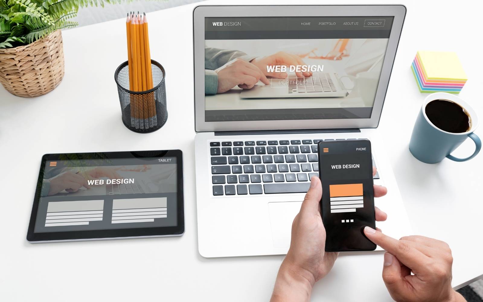
Web Design Mistake #4: Not having a FULLY responsive website
Most of your website visitors are using mobile devices. In fact, approximately 90% of your site traffic is occurring on phones or tablets.
So if your website isn’t fully responsive, it’s very likely you’ll experience a high bounce rate.
And this is one of the easiest web design mistakes you can avoid if you hire the right professional. Designers are trained and experienced with creating websites that are fully responsive. To learn more about our Edmonton Web Design services, click here!
Web Design Mistake #5: Not having enough white space between elements
This is another common web design mistake we see all the time. Some business owners think the more they can pack onto a page on their website, the better. And to avoid an overly long page, they squish their elements together.
However, not having enough white space between your elements can create visual fatigue. Also, since 80% of your visitors are scrolling through your website, having elements packed together will make pulling out important information more difficult.
Web Design Mistake #6: Too many pop-ups or ads
Your visitor is coming to your website because they believe you’ll provide a solution to their problem. If they’re bombarded with multiple ads or popups upon landing on your site, there’s a good chance they’ll feel overwhelmed and bounce.
Now, that’s not to say you can’t have an option pop up. These can actually lead to high conversion rates. However, it’s important to set the pop up so it comes up after your visitor is already on your site for longer than 10 seconds or until they scroll down to 30% of your site.
Another aspect of ads and pop ups to be aware of is site speed. Programs such as AdSense are notorious for slowing down websites, which will affect your customer journey and your SEO ranking. If you do opt to include ads on your website, limit the amount so it doesn’t bog down your design or slow your site down.

Web Design Mistake #7: Not optimizing your images
This is one of the easiest web design mistakes to fix, even if you’re not that tech savvy.
How many times have you downloaded an image from a stock site and placed it directly on your website without resizing?
Original images are very large, at times ranging as high as 15 MB. When you have a large image on your website, it’ll take a while to load. And a slow site means a high bounce rate and a poor SEO ranking.
You can optimize your images one of two ways:
- Manually resize them using any photo editing software, such as Photoshop, Canva, or TinyPNG
- Download a WordPress plugin, like Smush or Optimus.
A plugin will automatically optimize your images. This is particularly useful for any e-commerce or image-heavy site.
Web Design Mistake #8: Having important items below the fold
It only takes about 0.05 seconds for your visitors to form an opinion about your website. So if your visitors don’t automatically understand what you do and who you serve, there’s a low likelihood they’ll keep scrolling.
The above the fold section of your website, as mentioned earlier, is the topmost section that your visitors see upon landing on your site. This term comes from the old adage of referring to the first fold of a newspaper, where the most exciting and engaging headline and image would be placed on the cover.
Your most important call to action (like Get a Quote or Sign Up) should be above the fold. In addition, you’ll want to include some short, enticing copy that reflects what you do and the problem you solve. In the tagline, you’ll also include a quick sentence about the main benefit your customer will receive upon purchasing your product or service.
Web Design Mistake #9: Not researching & designing for your ideal customer/client
This is perhaps one of the most important web design mistakes to avoid.
Not everyone in the world will be your customer. In fact, it’s very likely only a select amount of people will ever be interested in purchasing your product or service.
And it’s important to design your website for your ideal customer—the very person that you want to serve and who is most likely to buy your offer.
So what does this entail?
You need to have a clear idea of who exactly you’re serving. If you’re struggling with narrowing down your ideal customer, check out our marketing strategy sessions, where we’ll help you uncover all aspects of your brand (including customer personas) and build out a marketing plan designed to maximize results.
You can also research your ideal customer using social media and surveys. Once you have a solid understanding of their pain points, wants, and needs, you can build out a website strategy for your key customers.
And it’s always important to remember: you’re not designing a website for yourself. You’re designing a website for your ideal customer.
Web Design Mistake #10: Including long blocks of text
As we’ve already established, most of your website visitors will scroll through your website. Very rarely do people read every word of copy on a page.
For that reason, it’s important to design a scroller-friendly website, where visitors can easily pick out the key pieces of information.
Here are a few ways to do this:
- Use bulleted or numbered lists
- Keep your copy short and concise, focused on how you provide the solution to your customers struggles
- Incorporate icon boxes
Generally speaking, if your webpage copy has paragraphs that are more than 3 regular-sized sentences, it’s time to break it up into smaller chunks. However, when designing the text components of your website, it’s imperative that you keep your ideal customer in mind and ask yourself, “will they take the time to read this paragraph?”
Final Thoughts: Web Design Mistakes to Avoid
Design is a highly creative process. And designers spend years educating themselves and mastering their craft. They have the eye, experience, and technical knowledge to not only create visual masterpieces, but to also understand the importance of your customers’ journey and experience.
That being said, most times is better to trust the home of your brand to an expert. If you know you need a new website and your DIY methods are no longer cutting it, check out our Edmonton web design services.
Each website we design is fully responsive, fast, and uniquely branded to your business. Our designers keep up to date with the latest trends and practices, so you get a website optimized for your conversion goal.
Have questions? Contact us!


